Your YouTube thumbnail image is more than just an aesthetic choice. It’s one of the most important decisions you’ll make for each video.
Whether users are looking through their homepage or browsing videos related to a search, your YouTube video thumbnail is what grabs their attention and gets the almighty click.
If you want your YouTube channel to perform well, your first step is creating thumbnails that follow YouTube’s guidelines regarding sizing. In this guide, you’ll find the perfect YouTube thumbnail size, plus six best practices to make the clickiest thumbnails around.
The best image size for YouTube thumbnails
YouTube has four important guidelines when creating custom video thumbnails. If you follow them step-by-step, you’ll attract potential viewers on the social media platform:
- Ideal YouTube thumbnail size: 1280 x 720 pixels, with a minimum width of 640 pixels.
- Aspect ratio: 16:9.
- Maximum file size limit: 2MB.
- Image formats: JPEG, PNG, GIF, BMP. (JPEG or PNG usually work best to keep your thumbnail crisp and under 2MB.)
6 YouTube thumbnail best practices
Creating effective YouTube thumbnails is essential for attracting viewers and increasing click-through rates on your videos.
A great way to get a feel for which thumbnails do well is to browse your competitors’ YouTube channels. But it’s important to keep in mind that YouTube goes through "thumbnail design phases.” That is, some thumbnail styles surge in popularity for a while only to then become obsolete.
So there aren't one-size-fits-all guidelines that’ll guarantee thumbnail design success—but there are basic principles that can help you get there. Here are some key tips and general best practices to keep in mind when designing your next thumbnail:
1. Capture attention
Your thumbnail works much like a profile picture on a dating app. You want to make a great first impression without overselling yourself. YouTube users are judging a book by its cover, except in this case the book is your video content.
You can have the right YouTube thumbnail size, but to capture your audience’s attention, you need to make them curious about what’s behind that thumbnail.
Here’s how to do it:
Use contrasting colors
Using bright, vibrant colors can evoke excitement and intrigue while making certain elements of the thumbnail stand out. Contrast helps in drawing attention to specific areas of the thumbnail, making it more engaging.
Elicit emotion and connection
Thumbnails that tap into human emotions, such as curiosity, excitement, humor, or surprise, can establish a deeper connection with viewers. It helps to use thumbnails that evoke emotional responses relevant to the video content.
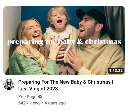
Here’s an example by Zoe Sugg on YouTube. The image depicts a moment of joy that shows a candid, heartfelt emotion that resonates with viewers. The text “preparing for baby & christmas,” along with the image, suggests they are in the midst of an exciting life event, which can invoke empathy and nostalgia.
|
Incorporate faces
Incorporating human faces in thumbnails often leads to higher click-through rates. According to one study from Thumbnailtest.com, images featuring a person’s face can make viewers more likely to click. It turns out, our brains are hardwired to respond to a friendly face—even if it’s just a still image.
Be consistent
Consistency in thumbnails helps in building a recognizable brand. It also helps to include a small logo to establish audience familiarity. You want repeat users to come across your thumbnail and remember who you are.
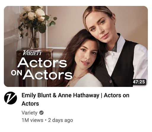
Variety does a great job of including its logo without taking away from the thumbnail’s focal point with its “Actors on Actors” YouTube series.
|
🧠 Learn: How to make a YouTube banner that attracts an audience, with examples
2. Optimize for mobile
Roughly 90% of YouTube traffic comes from tiny screens—even if our phones have grown as large as snack trays. That means your thumbnail must shine on mobile, not just on a 27-inch monitor. Sure, a design might look fine when you’re zoomed in on a desktop, but squish it down to phone size and suddenly the text is microscopic, and your glorious background is a smudge. Stick to large, clear fonts and simple images that hold up when shrunk.
A thumbnail that looks good on a larger screen might lose its clarity or impact when viewed on a smaller mobile screen. Key elements of the thumbnail, like the text and the main image, need to be easy to see no matter what screen it appears on.
Any text you include in thumbnails needs to be big enough to be legible on mobile screens. Using larger, bolder fonts and keeping text concise is the way to go here. Otherwise, if the text is too small or complex, it may become unreadable or much harder to read on mobile screens, which will result in more users scrolling right past your content.
You also want to aim for image clarity, too. On mobile screens, details can be lost if the image is low resolution or too cluttered. Take the time to test how your thumbnail will display on different phone screens and follow the YouTube thumbnail dimensions mentioned above.
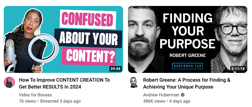
Notice how channels like Andrew Huberman and Video for Bosses hit just about every requirement for best performance for a mobile-first viewership:
- Each of their fonts are easy to read
- They use a large font size
- The contrast in text and background color makes text easier to read on a small screen
- Images included in both thumbnails are clear and include a human face with emotional expressions
|
3. Don’t overdo it
While it’s important to be creative, avoid cluttering your thumbnail with too much information or too many elements. A clean, simple design often works best and is more visually appealing.
Now, striking that balance between creativity and simplicity can be trickier than it sounds—especially if you’re battling the urge to cram everything into one tiny image. That’s why so many creators end up with cluttered thumbnails. But consider how much more compelling a neat, focused design can be.
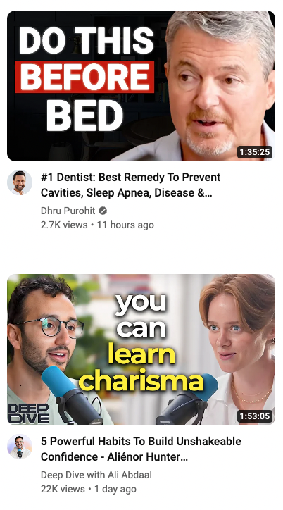
For example, Deep Dive with Ali Abdaal and Dhru Purohit both keep it simple but captivating. Their thumbnails use bold text to grab attention and a quick credibility cue so you instantly know who’s talking and what you’ll learn.
|
But wait—how do you know when you’re overdoing it with thumbnails? That answer depends on the type of content you create, who your target audience is, your brand aesthetic, and what your end goal is. A lot of it takes A/B testing to find out what really works for your brand (more on that below).
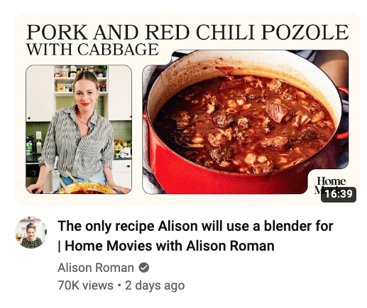
Consider some examples of thumbnails that are so busy, they fade into the background among other, more attention-grabbing designs. In this one from Alison Roman, the colors are neutral, and the design tries to fit too much within a small space.
The serif font is also easy to miss as you’re scrolling through an endless choice of videos. Assuming this thumbnail was created to optimize for viewership, there are some revisions that could strengthen the visuals as a whole.
|
One way to achieve a balance between simplicity and creativity is to stay consistent with your thumbnail designs. Consistency in design elements like colors, fonts, and imagery makes your content easily identifiable to your audience. Easy enough, right? However, figuring out what colors, fonts, and image styles you want to stick with will take some figuring out — so experimenting is key here.
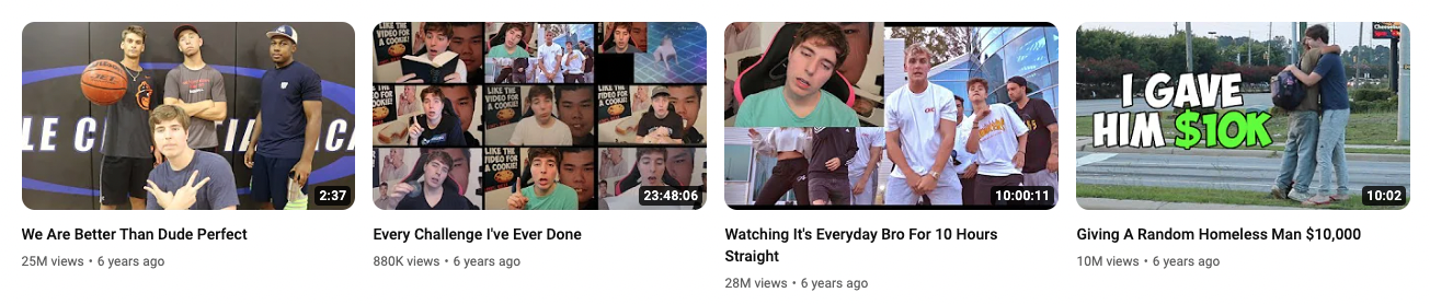
Popular YouTubers like MrBeast, whose thumbnails are visually striking and maintain a consistent style, have helped him build a recognizable brand and YouTube channel with millions of subscribers.
Just check out what his thumbnails looked like six years ago versus what they look like now:
Before
|
After

|
Note that as times change and viewer preferences change with it, Mr. Beast tweaks his thumbnail designs and experiments with what works in order to get the most viewership possible.
4. Run A/B tests and optimize
You never know which thumbnail will knock your views out of the part, which is why A/B testing should be part of your video marketing strategy.
A/B testing for YouTube thumbnails involves creating two different versions of a thumbnail for the same video and then comparing which one performs better in terms of viewer engagement and click-through rates.
It’s a powerful way to understand what resonates with your audience and what doesn’t. Here's how you can effectively run A/B tests for your YouTube thumbnails:
- Create two distinct thumbnails: Design two different thumbnails for your video. For example, one thumbnail could feature a still image of a close-up of a person's face with an expressive emotion, while the other could focus more on text or other graphical elements relevant to your content.
- Use each thumbnail for a set period: Assign each thumbnail to your video for an equal amount of time. This could be a few days, a week, or even months, depending on your channel's traffic. The longer you run the A/B test, the more data you have to work with. Remember to keep everything else about the video the same, including tags, video titles, and descriptions.
- Analyze the data: After each thumbnail has been live for the same duration, analyze the data. Look at key metrics such as click-through rate (CTR), watch time, and the number of views. YouTube Analytics provides valuable insights into these metrics.
- Compare the results: Determine which thumbnail performed better. Did the one with the face get more clicks? Or did the audience prefer the more graphic-focused version? Sometimes the outcomes are not what you’d expect, so pay attention to the data.
- Apply your findings: Use the more successful thumbnail as your permanent choice, and apply the learnings to future thumbnails and A/B tests.
Let’s say you have a cooking channel and you post a recipe video. You might create one thumbnail that shows the finished dish and another that features you tasting the dish with a delighted expression. After testing each thumbnail for a month, you might find that the thumbnail with your expression drives more engagement, indicating that your audience prefers thumbnails with human elements.
Remember, A/B testing is not a one-time activity. It's an ongoing process of refinement and learning that’ll help you get deeply familiar with your audience’s preferences.
5. Use attractive colors
What even is an “attractive color”? Well, colors play a crucial role in thumbnail images.
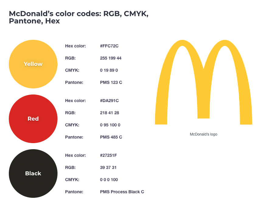
Ever think about why huge fast food brands like McDonald’s use such rich, contrasting colors—red, yellow, and black? They complement each other and make each other stand out more when you set them side by side.
 |
You can create the same effect with your thumbnails. To help you choose your colors, it’s important to understand some color psychology, which is a field of study devoted to understanding how color affects human behavior and decision-making. When it comes to attracting attention, certain colors are known to be more effective than others.
Here’s what each color tends to communicate to the human brain:
The red color spectrum: Warm colors like red, orange, and yellow are associated with a range of strong emotions, from cozy warmth and comfort to intense anger and hostility.
The blue color spectrum: Blue, purple, and green, on the other hand, are referred to as cool colors. They evoke feelings of tranquility and calmness, but they can also express sadness.
Contrasting combinations: Color contrast (like yellow text on a blue background) can help your thumbnail pop off the screen and ensure the text is legible.
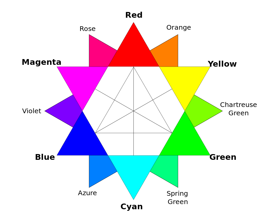
Finding contrasting colors can be as easy as choosing a color on the color wheel and pairing it with the color directly opposite to it. For example, you can pair red and cyan for a highly contrasted color combination. Purple and green or even orange and blue can also work.
 |
6. Tell a story
Your thumbnail should tell a story or hint at it. You can do this several ways—including through the use of expressive faces, props, or an intriguing thumbnail background. Including numbers within your thumbnails can work well if it's a relevant part of your video.
If you’d rather use text within your thumbnail to tell a story, think about “hooks” that make viewers curious. These can be hooks like:
- I finally learned how to X
- Here’s how to X
- I’m moving
- I did X in X days
- Why they will X
Here’s an example of one by Big Think showcasing the story of OpenAI. The image of Sam Altman, with a serious and perhaps contemplative expression, is central. As a known figure in the technology and AI space, his image alone carries a story for those familiar with him and his role at OpenAI.
The red-orange background is intense and can be associated with urgency or caution. The words "Inside OpenAI's Implosion" are prominently displayed, suggesting an investigative or exposé style of content. The word "implosion" also conveys a sense of internal collapse or failure, which is a strong narrative hook.

|
How to make a good YouTube thumbnail with Descript
Step 1: Choose a frame for your thumbnail
Select a captivating frame from your video. For example, if your video is about baking cookies, pick a frame that shows a tray of freshly baked cookies. Your viewer will be drawn to a clear, high-quality image with good lighting.
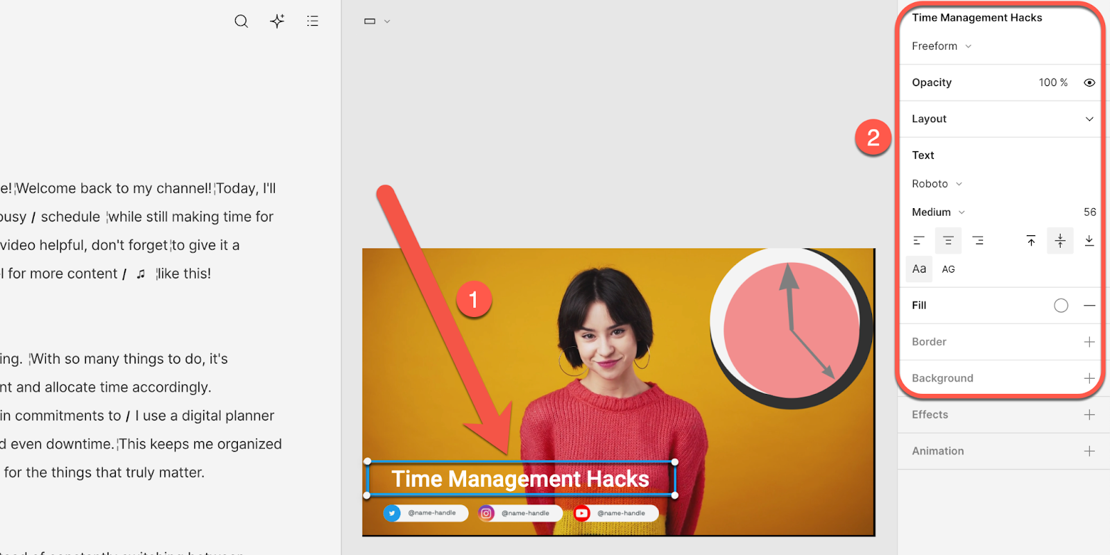
Step 2: Add text and custom graphics
Next, enhance your thumbnail with text and graphics. Your text should be concise and catchy. For example, going along with the cookie example, your text might read, “Easy Homemade Cookies in 30 Minutes!”.
Descript offers a variety of font styles and sizes. You can also stylize your fonts, adjust the size and color, and align text so your message stands out.
|
💡Note: If you want to use a specific font, you can choose from Google’s library of free fonts or upload a custom font file from your computer.
Custom graphics like arrows, borders, or icons can also highlight key elements of your thumbnail. In Descript, you can upload graphics in the Media library and add them to your frame.
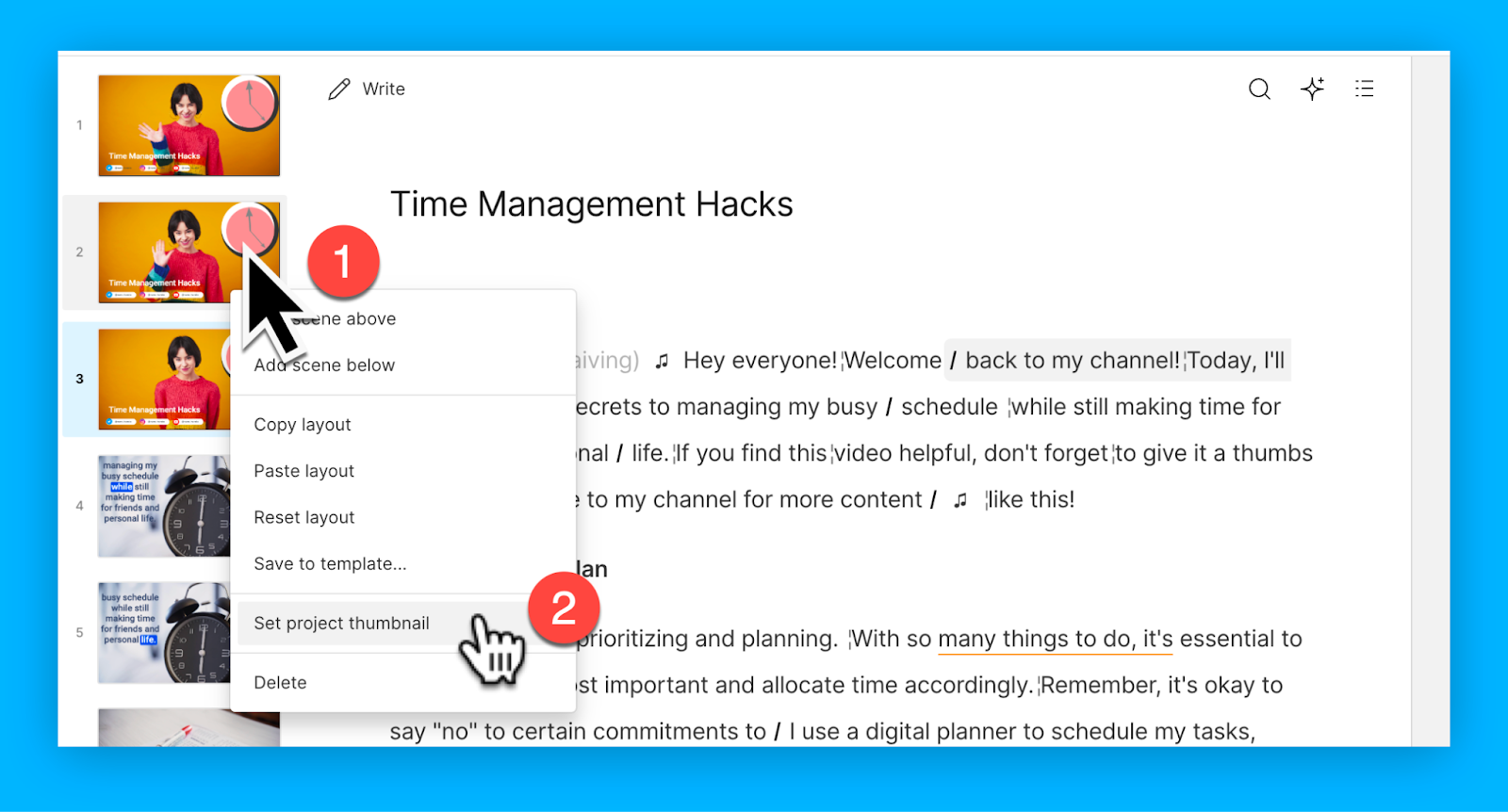
Step 3: Set the project thumbnail
Once you’ve designed the thumbnail, right-click the scene in the left rail and select the Set project thumbnail option. When you upload your YouTube video from Descript, it’ll use this frame as your thumbnail.
|
Alternatives for making a YouTube thumbnail
Use a graphic design tool like Adobe Photoshop or Canva, which provides handy YouTube thumbnail templates to speed up the creation process.
Then, import your JPG. screenshot and start adding engaging elements such as bold fonts, eye-catching colors, and relevant graphics. You can then upload this thumbnail to Descript and publish directly to YouTube, which you’ll learn in the next section.
How to upload a custom YouTube thumbnail
Uploading a custom thumbnail image is easy. You can do this in Descript or in your YouTube Studio dashboard.
Descript
By default, the thumbnail on your page will be the first frame of your video. By clicking on the thumbnail preview, you can change it.
|
To use a frame from your video as a thumbnail:
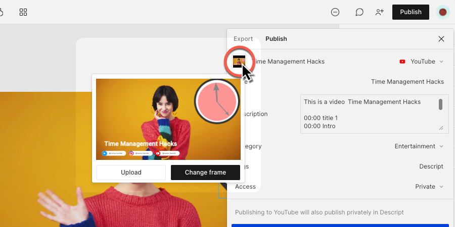
- Click on the thumbnail in the publish panel.
- Select Change frame.
- Use the slider at the bottom of the video preview to move through your video.
- Once you find the frame you want to use, select Use frame.
To upload a custom thumbnail:
- Click on the thumbnail in the publish panel.
- Select Upload.
- Choose the image you want to use.
YouTube
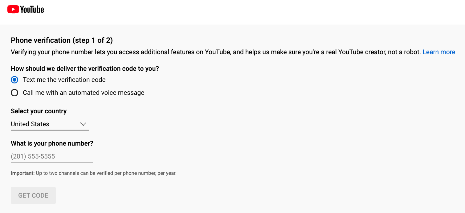
Step 1: Verify your YouTube account
To upload custom thumbnails, your YouTube account must be verified. Visit the YouTube verification page, enter your phone number, and you'll receive a verification code via text or voice call. Enter this code on the verification page to complete the process.
|
Step 2: Navigate to YouTube Studio
After verification, open your YouTube Studio account. You can access it by navigating over to your profile picture located in the top right corner of the YouTube homepage. In the drop-down menu, select "YouTube Studio.”
Step 3: Select the video
In YouTube Studio, click on "Content" from the left-hand side menu. This will display a list of your uploaded videos. Choose the video you want to add a custom thumbnail to by clicking on it.
|
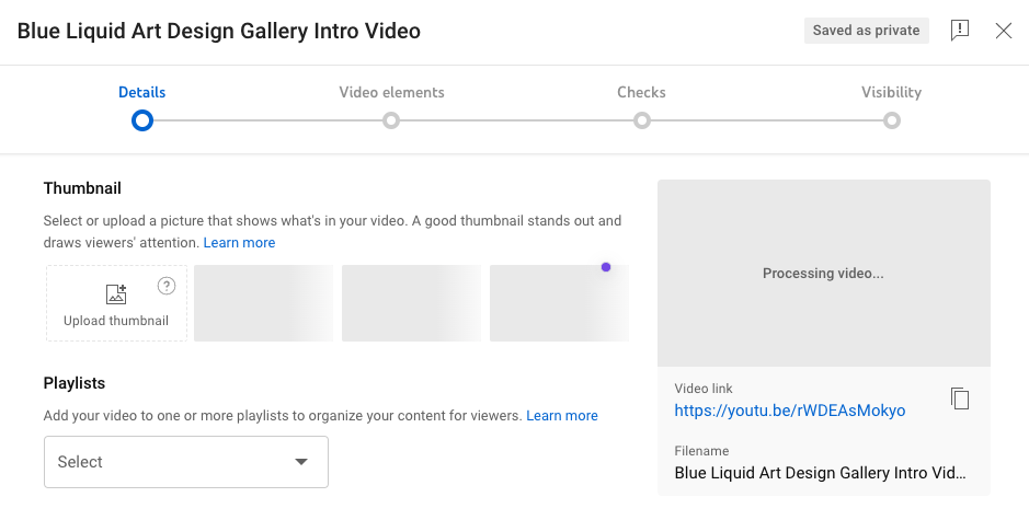
Step 4: Upload the thumbnail
Once you're on the video details page, you'll see a section labeled "Thumbnail" with a few auto-generated thumbnail options. Beside these preview images, tap on the square labeled “upload thumbnail.” Select your thumbnail file from your computer, and upload it.
|
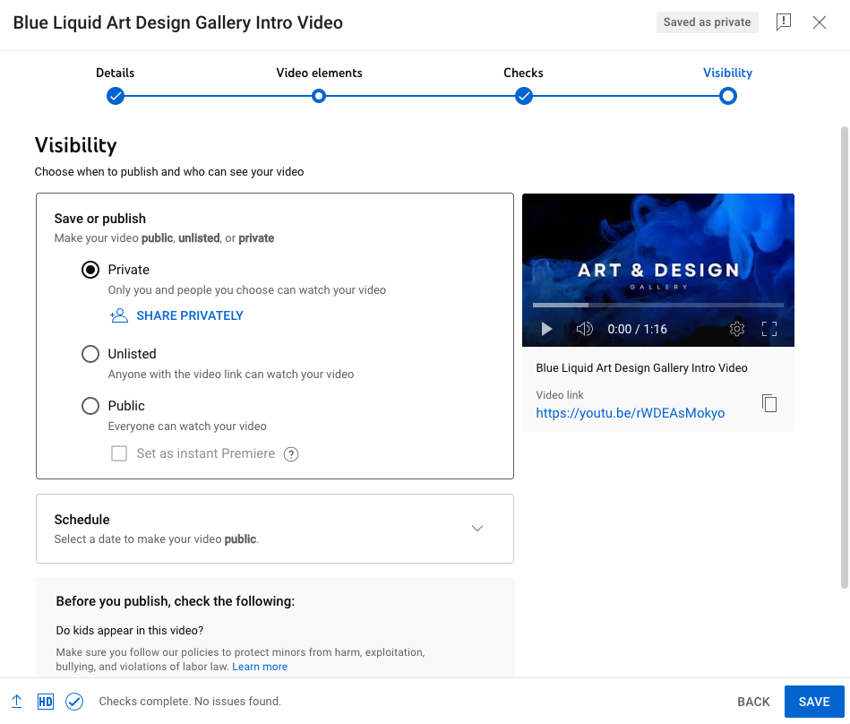
Step 5: Save your changes
After uploading the thumbnail, make sure to save your changes. You'll find a “Save” button, usually at the top right corner of the screen. Click on it to ensure your custom thumbnail is set for your video.
|
Video editing software to go viral on YouTube
YouTube marketing stretches far beyond creating good thumbnails. To make your channel a success, you need to produce videos with the right filters, effects, sound, and transitions.
Descript’s YouTube Video Editor can help you produce scroll-stopping content that gets those clicks and conversions. With a free account, you’ll get access to a ton of AI features that speed up your workflow, including:
- Ability to edit videos like you’d edit a Google Doc
- Create professional grade audio with Studio Sound
- Use video templates with on-screen text, shapes, and animations
- Transcribe your video with animated captions for accessibility
- Turn text into speech for simple voiceover ads
- Easily trim and resize Shorts with the YouTube Cutter
Some of the world’s top creators rely on Descript to make viral YouTube videos. Join them today and take a free trial of Descript, where all premium features come as standard.
Frequently asked questions
Below you’ll find answers to the most common questions about YouTube thumbnail sizes.
Is YouTube thumbnail size 1280x720 or 1920x1080?
YouTube recommends 1280 x 720 pixels with a 16:9 aspect ratio. While you can use 1920 x 1080, YouTube compresses thumbnails, so the difference in clarity is usually minimal.
Is YouTube thumbnail size 16:9?
Yes. YouTube’s recommended aspect ratio for thumbnails is 16:9, which matches how most videos are displayed on the platform.
What is the recommended YouTube thumbnail size in 2025?
The guidelines remain the same: 1280 x 720 pixels, a 16:9 aspect ratio, under 2MB, and saved as a JPEG, PNG, GIF, or BMP.
Is YouTube thumbnail 4:3?
No. YouTube recommends a 16:9 aspect ratio for thumbnails, which better fits modern widescreen video.


%20(1).JPG)