As an educational creator, I often have a simple problem: I need to use on-screen text—things like key terms, a quote, or a news article—but I don't want to spoil my video's visual appeal. Thankfully, I've found quite a few solutions to this problem.
In fact, I've found so many solutions that it can be tempting to go overboard—think online templates for text that looks like it came straight out of a flashy ad. Those are great, if you like them, but the tools below are simpler, and more subtle. And importantly, they're easy for beginners to recreate in many types of video editing software—including Descript.
Many of these tools can be used together, and will often work better together.
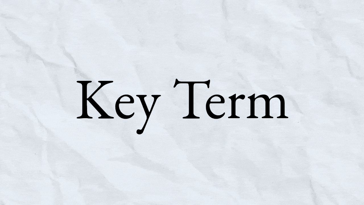
Layer texture
One of the easiest ways to upgrade your on-screen text is with texture and motion in the background. Paper is a go-to for many educational creators, and easily done in Descript using the stock library. Just search “paper” in the stock panel and layer the image below your text.

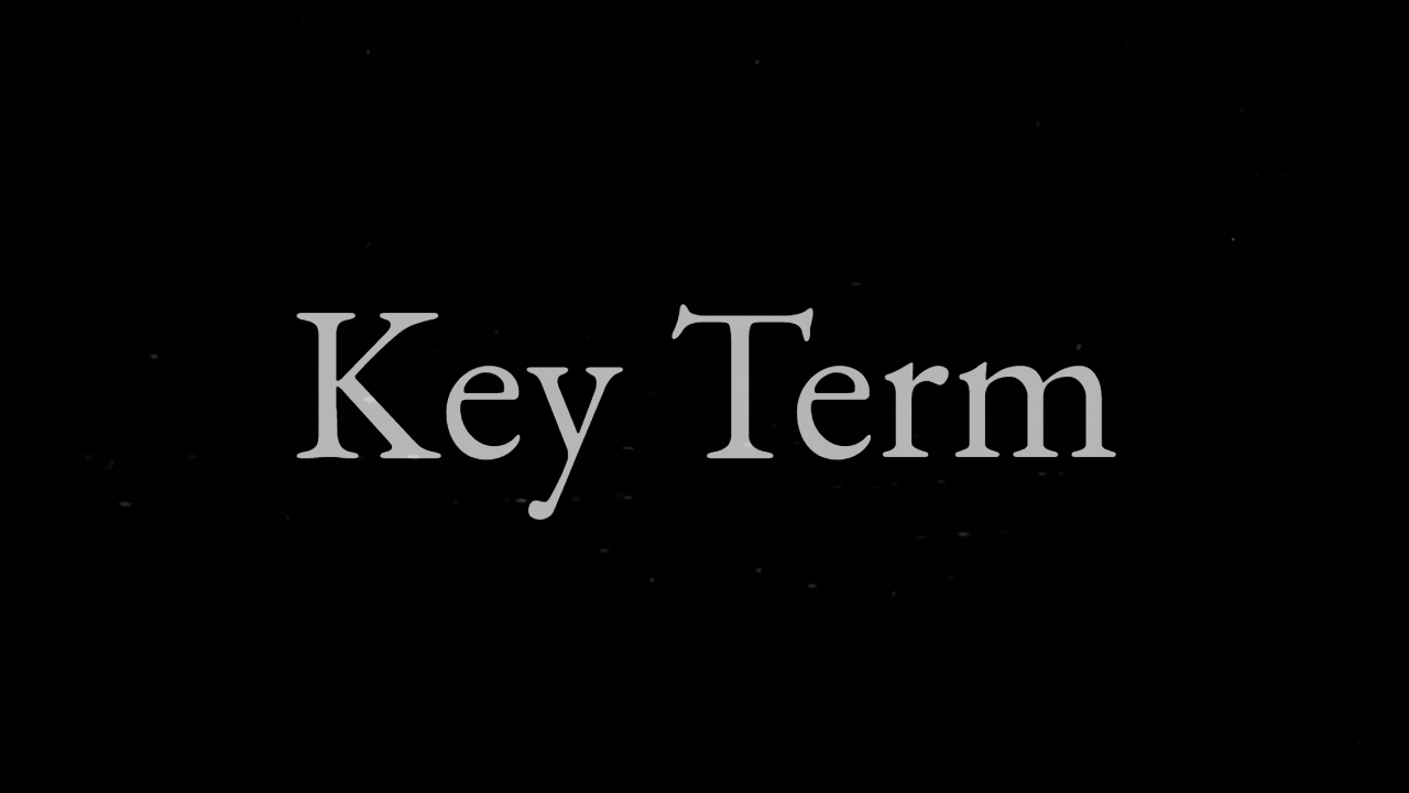
But that might still feel a little static. You can also get stock video of paper with a crinkling animation to make the text feel a little more dynamic.
There are many types of paper to choose from, too. Phil Edwards opts for a dot grid paper background to lay over key text from his sources, and plenty of other creators have tried graph paper, a yellow legal pad, or a crumpled up napkin.
You can also add some texture by layering stock elements over the text. In the example below, the text is overlaid with stock footage of film grain (also available in Descript) to get an effect like this.
Try experimenting with other elements to layer over your text, like scan lines from an old CRT TV or glitches from a VHS tape (both available, you guessed it, in Descript—just click Overlays in the Elements panel.)
Make the text dynamic
New creators might opt to put an entire phrase on the screen at once, which is fine. But with a little more experience, they might slide the text in from the side of the screen or have it fade in with some simple animations.
These are great starting points, and often used in more complicated compositions of on-screen text. But be careful of displaying an entire wall of text at once—not just for aesthetic reasons, but because it can overload the viewer with information.
A good alternative is to use tools that draw the viewer's attention to each word as the text is being read.
The easiest way to do this is with Descript’s captioning tool, which lets you highlight the word that's being spoken. With some resizing, you can get an effect that looks like this. This was done using the “Karaoke” captions in Descript.
Another common way to add motion to text is with a typewriter effect, where words type out as they’re spoken, usually supplemented by typewriter sound effects.
Layer the text over footage
One of the easiest cheats is to layer text over footage rather than a static background. Here’s an example from Lessons from the Screenplay.
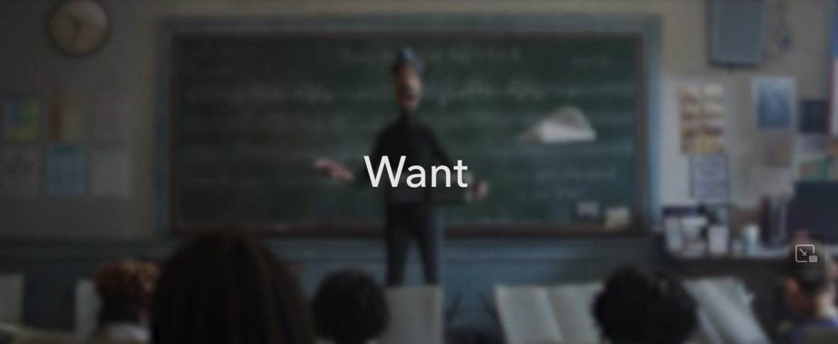
It’s one of the easiest ways to get good looking on-screen text without a shred of graphic design talent. You could put text over footage of you talking or relevant stock or archival footage.
You can create a similar effect in Descript by applying a blur to the footage and turning down the brightness. Some creators might tint the footage with a color to get a specific look.
Focus in on relevant information
Highlighting text is a beloved tool for educational creators. Here’s an example from creator Phil Edwards.
Highlighting text can draw viewers to important terms and phrases, but also make a static image dynamic with some simple effects.
In a lot of editing software, it usually boils down to drawing a rectangle over your text, lowering the opacity, and animating the rectangle to get longer and longer (to simulate a highlighter going over text). Here’s a helpful tutorial for Premiere. In Descript, you can create a similar effect by adding a “wipe” animation to a rectangle and increasing the duration until it looks right.
Another way to draw the viewer towards relevant information is to literally blur out anything they shouldn’t pay attention to. Phil Edwards uses that technique here to narrow the viewer’s vision.
Create a composition
A little bit of graphic design can go a long way in making on-screen text look great. Take the below example from Digital Spaghetti to introduce a piece of gear:
The text animates on screen next to a static image, and a speckled background has some light animation similar to the film grain effect described above. Evident composites a still of an old CRT TV screen with text to get the below effect.

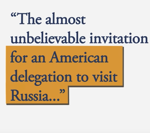
These are great options for introducing terms and items, but lots of creators struggle to effectively show other written sources: news articles or book excerpts, for instance. Many default to static screenshots of articles, or copy-pasted blocks of text over a simple background.
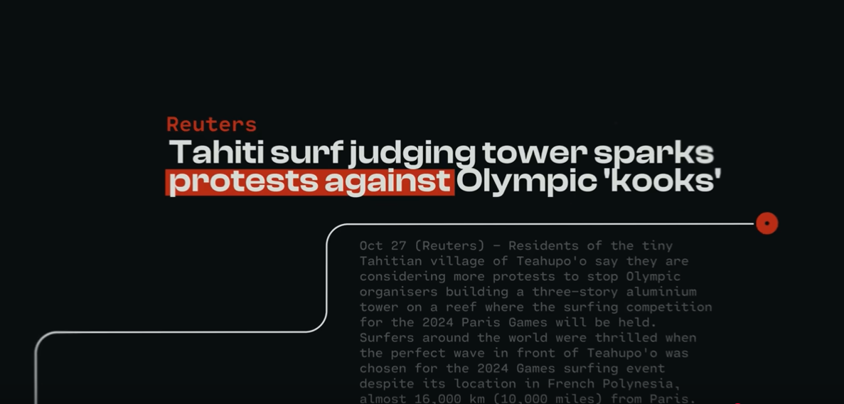
For those types of text, it's a great investment to spend time creating a well-designed template. Consider the below example from Search Party for sourcing a news article. While it features animated elements, it’s also a unique composition for displaying text.
Conclusion
Elevating your on-screen text doesn't require advanced graphic design skills—just thoughtful application of these accessible techniques. Play around with paper textures, throw in some highlight animations, or just slap your text over some blurred footage. Mix and match these techniques to find what works for you. As you get more comfortable, you'll develop your own style that keeps viewers engaged without distracting from what you're teaching.